The Jedlička Foundation. Campaign & Visual Style.
Assignment
About a year ago our school was asked by the Jedlička Foundation to create a marketing campaign for their 30th anniversary.
To be exact a visual style with an idea for a TV spot.
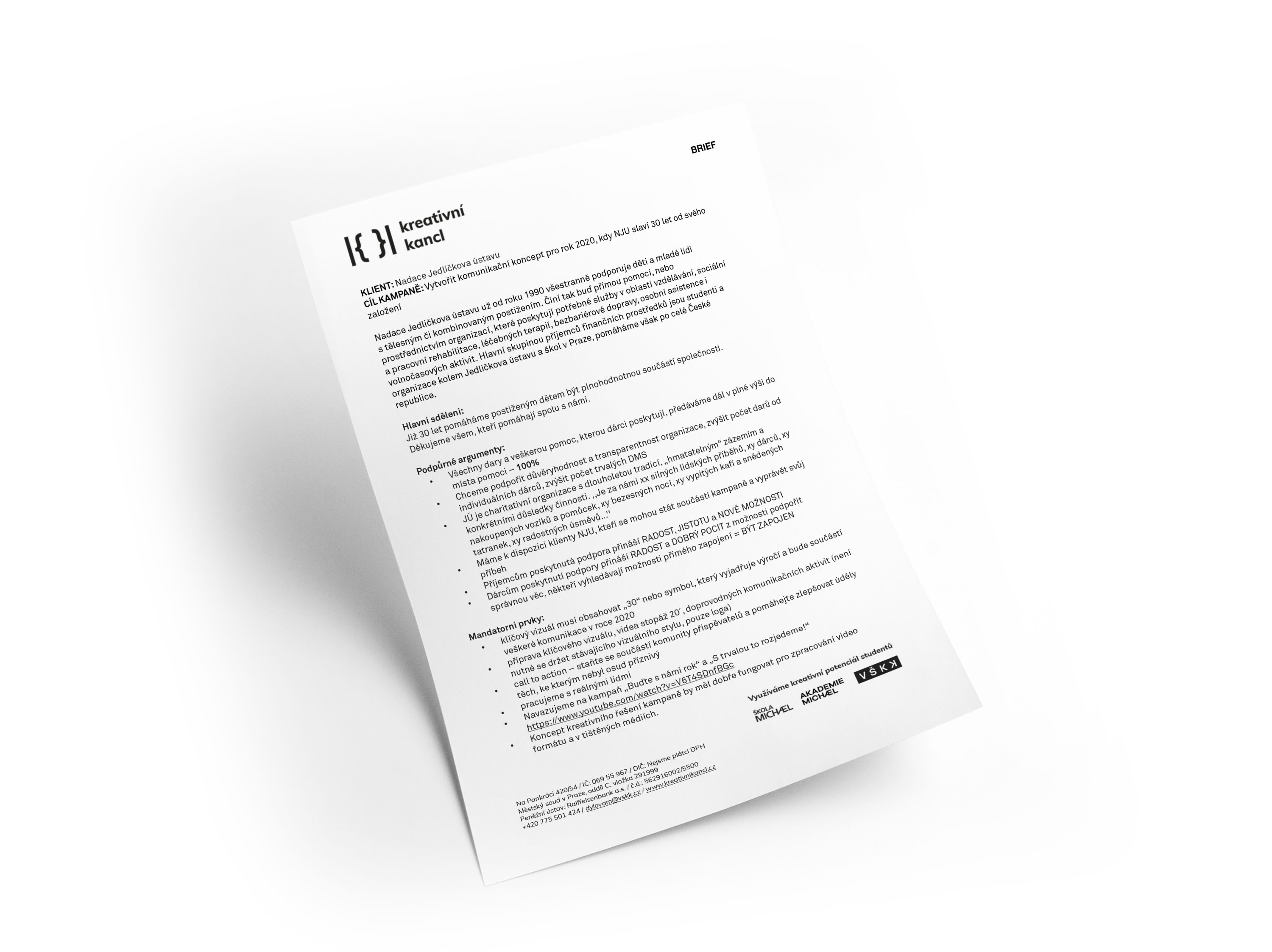
brief
Client
The Jedlička Foundation supports children and youth with a physical and combined disability since 1990. The main receivers of the finance are students of the Jedlička Institute and Schools in Prague. Other than that the foundation helps all over the Czech Republic.
Nadace jedličkova ústavu I Instragram I Facebook
Research
The first part of our preparation was to get to know the environment of the foundation supporting the handicapped. A big help was meeting with the manageress of the foundation and mainly their clients. By building mutual trust with the clients and hearing their stories we gathered very valuable information for preparing such a campaign to fulfill all the client’s expectations.
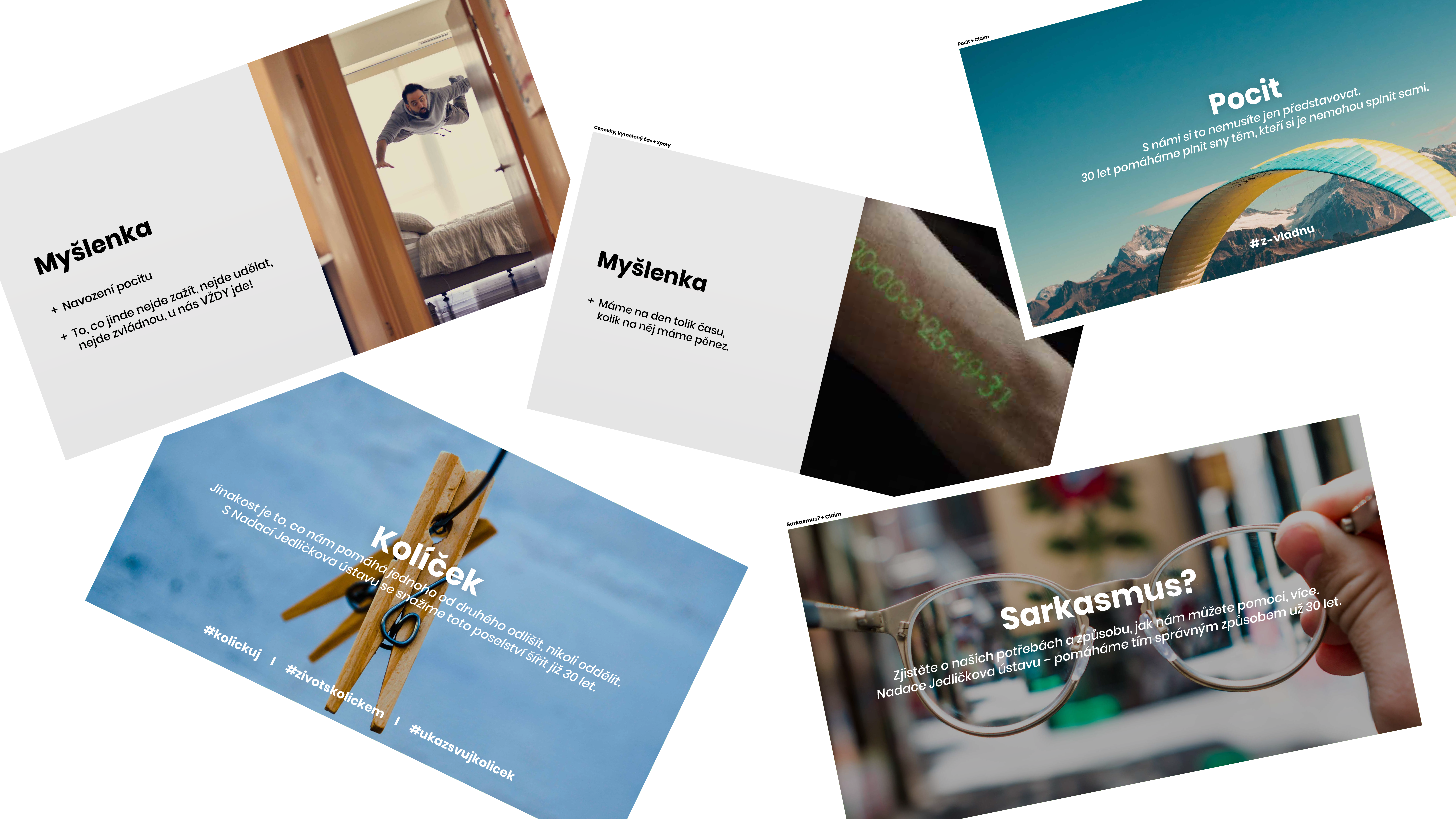
first ideas
Points we gathered during our research:
- The client doesn’t use real people but rather animation.
- The client communicates with sadness and compassion in their past campaigns.
- We want to create a story.
- We want to use real people and clients of the foundation.
- We want to be happy.
- We want to use real stories of handicapped people.
- We want to understand the needs of the client and handicapped people.
- People without a handicap can be afraid to communicate with handicapped people.
A Campaign Called: Green Peg
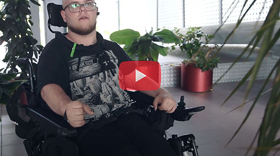
Green peg became a symbol of not only the campaign but also the whole foundation. A peg inspired by a real story of a current foundation’s client, Jakub. You can watch our interview with him in which you can find all the answers about the story and him.
Play Interview
As already told, people without a handicap can find it difficult to communicate with handicapped people. Particularly these people are those who are our main motivation and our main target group. Because of them, we decided to point out in the campaign that society does not need to be split into handicapped and people without a handicap. Nobody has to be afraid to make the first step. Our campaign, green peg, is supported by a slogan: “A peg connects us and nobody has to be afraid to make the first step to help others”.
Let’s all together concerning our abilities, let’s help build opportunities for ourselves and let’s be one society.
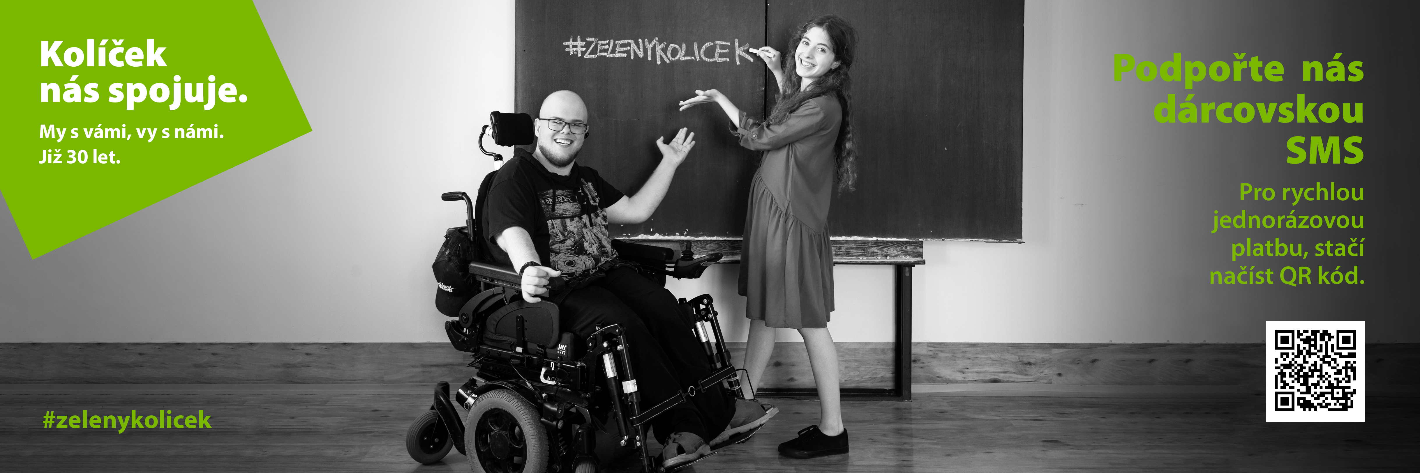
#zelenykolicek #koliceknasspojuje #nadaceju #jsijedenznas
Summary & Impact
Not only did we met the client’s expectations, but we also created something much stronger at the same time. Something that can help to keep the world of handicapped and not handicapped as one and connected. We gave the client a symbol in the shape of a green peg which will be representing the foundation for years to come. The client can in the next years build on a product that has a history but most importantly a story. We created a day of the peg and one day most of the people in the Czech Republic will know this day. Since 4th of November you can see our visual style in it’s full beauty and a TV spot to go with it. From now on not even, you have to be afraid to make the first step by buying a green peg.
TV spot
Thanks
My warm thanks for flawless cooperation goes to my two classmates Týna Janoušová and Jan Rákosník. They were an integral part of the project and thanks to them it was one hell of a ride.
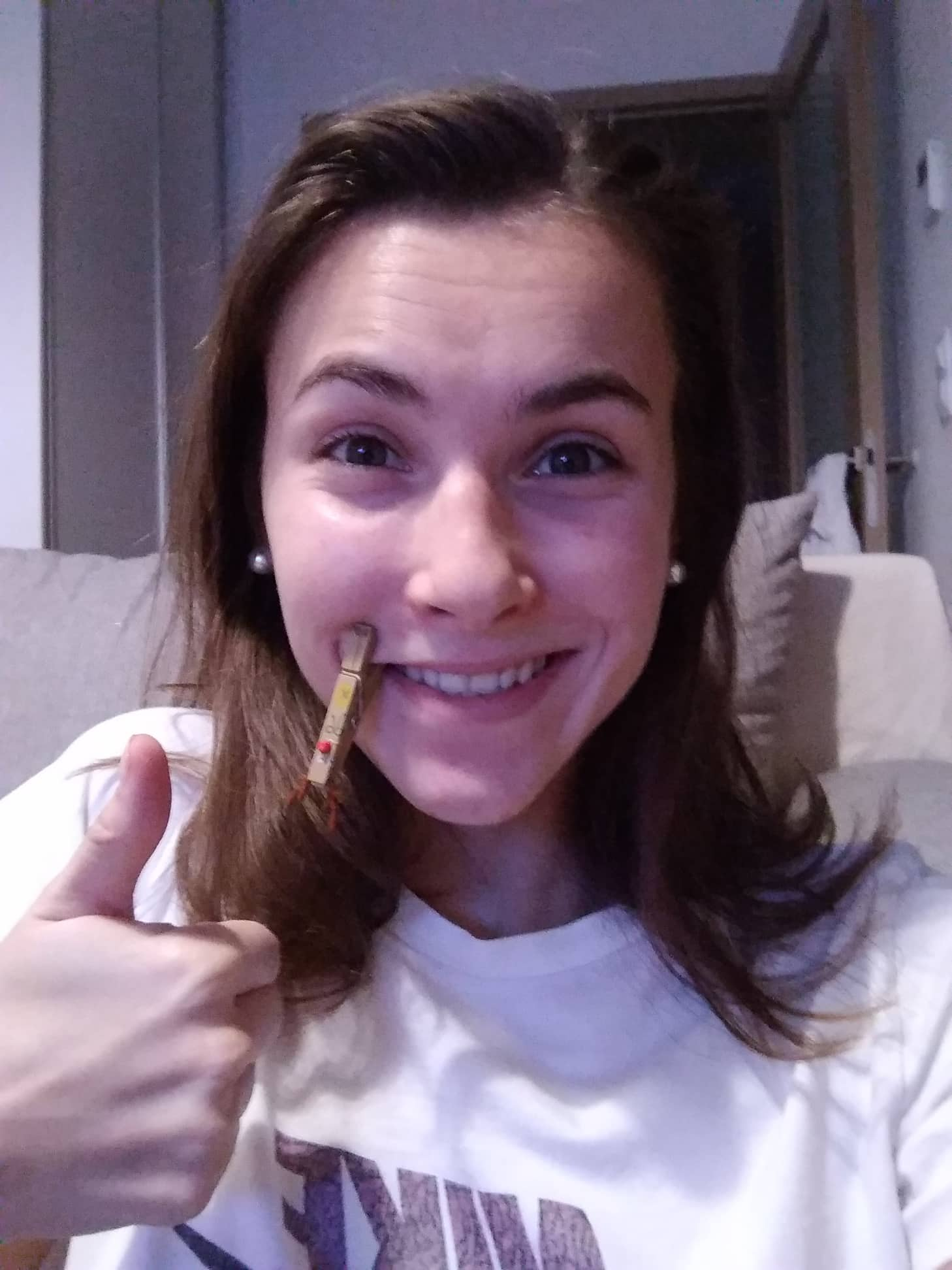
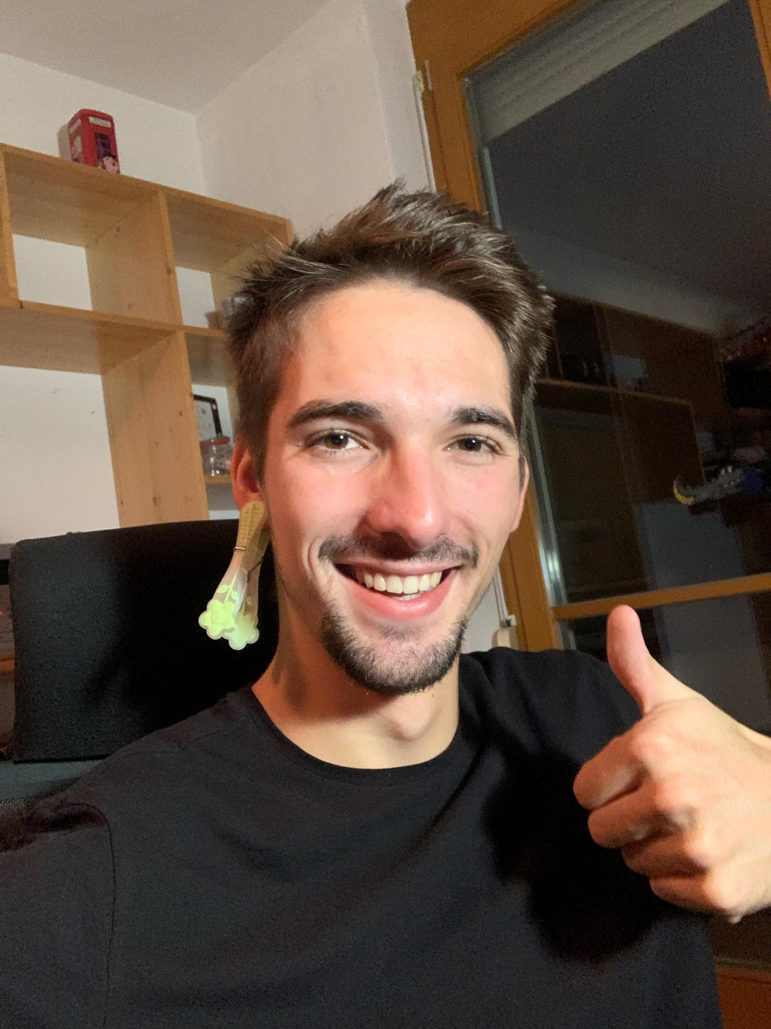
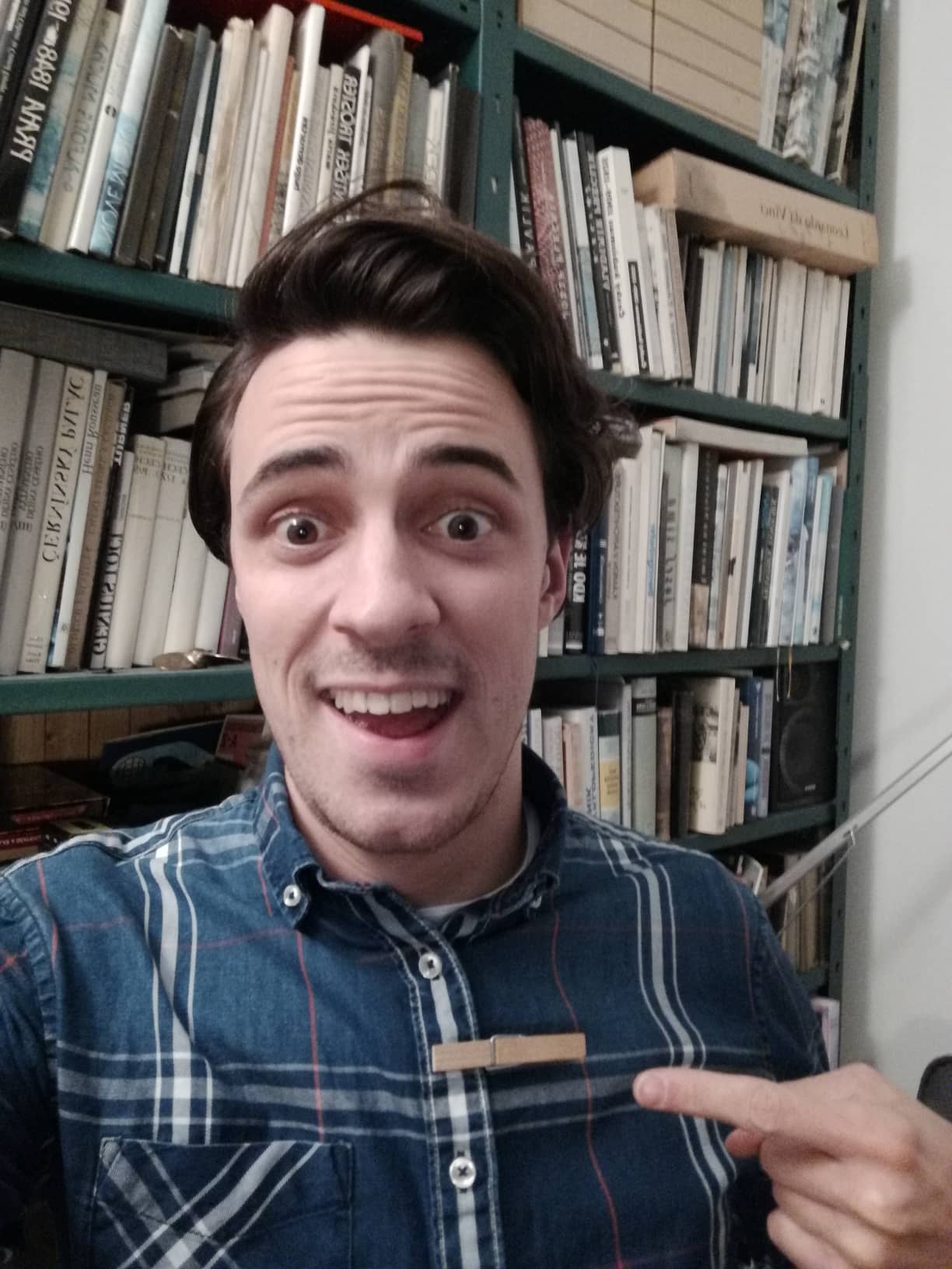
# Campaign Photo Collection
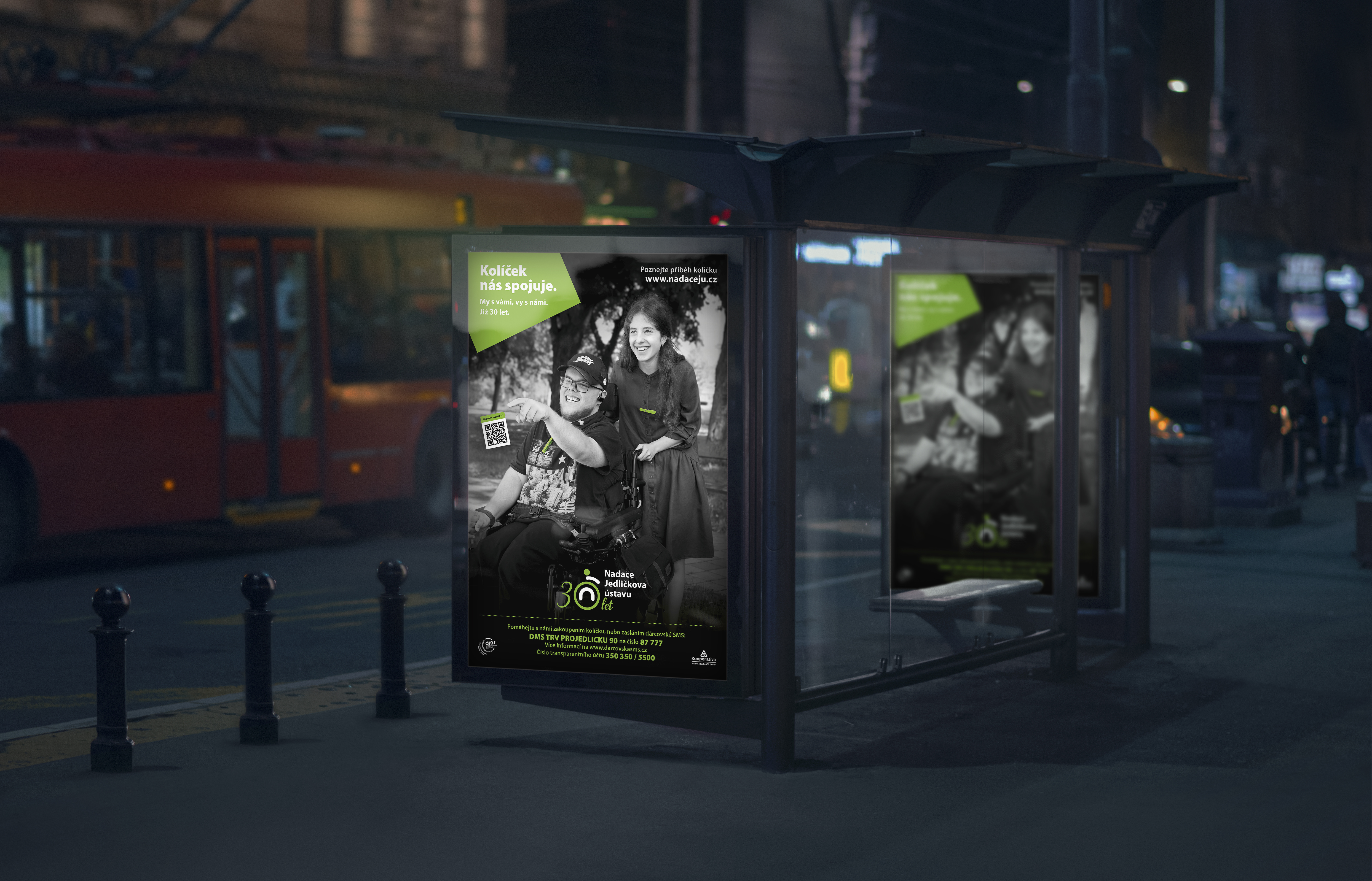
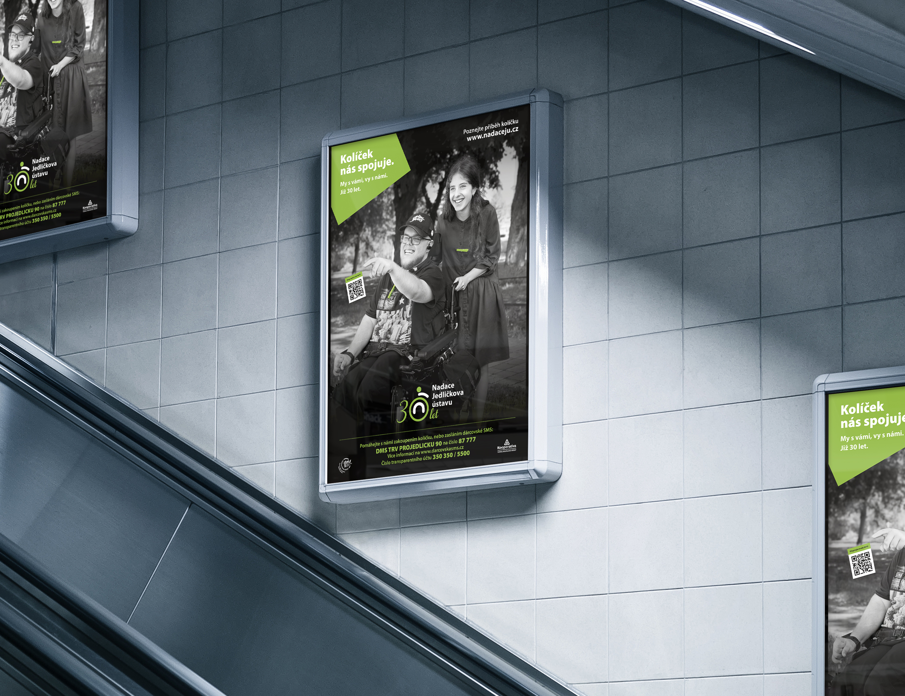
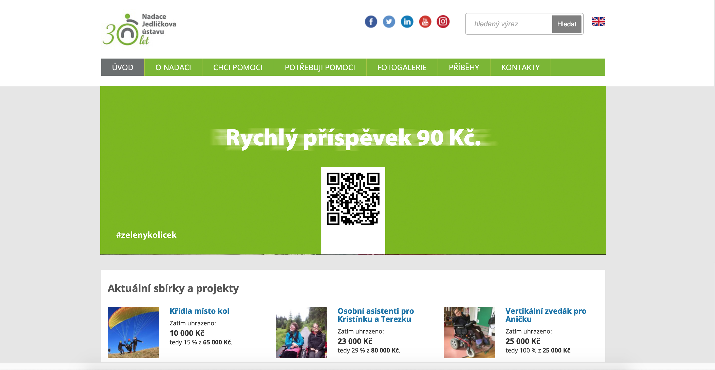
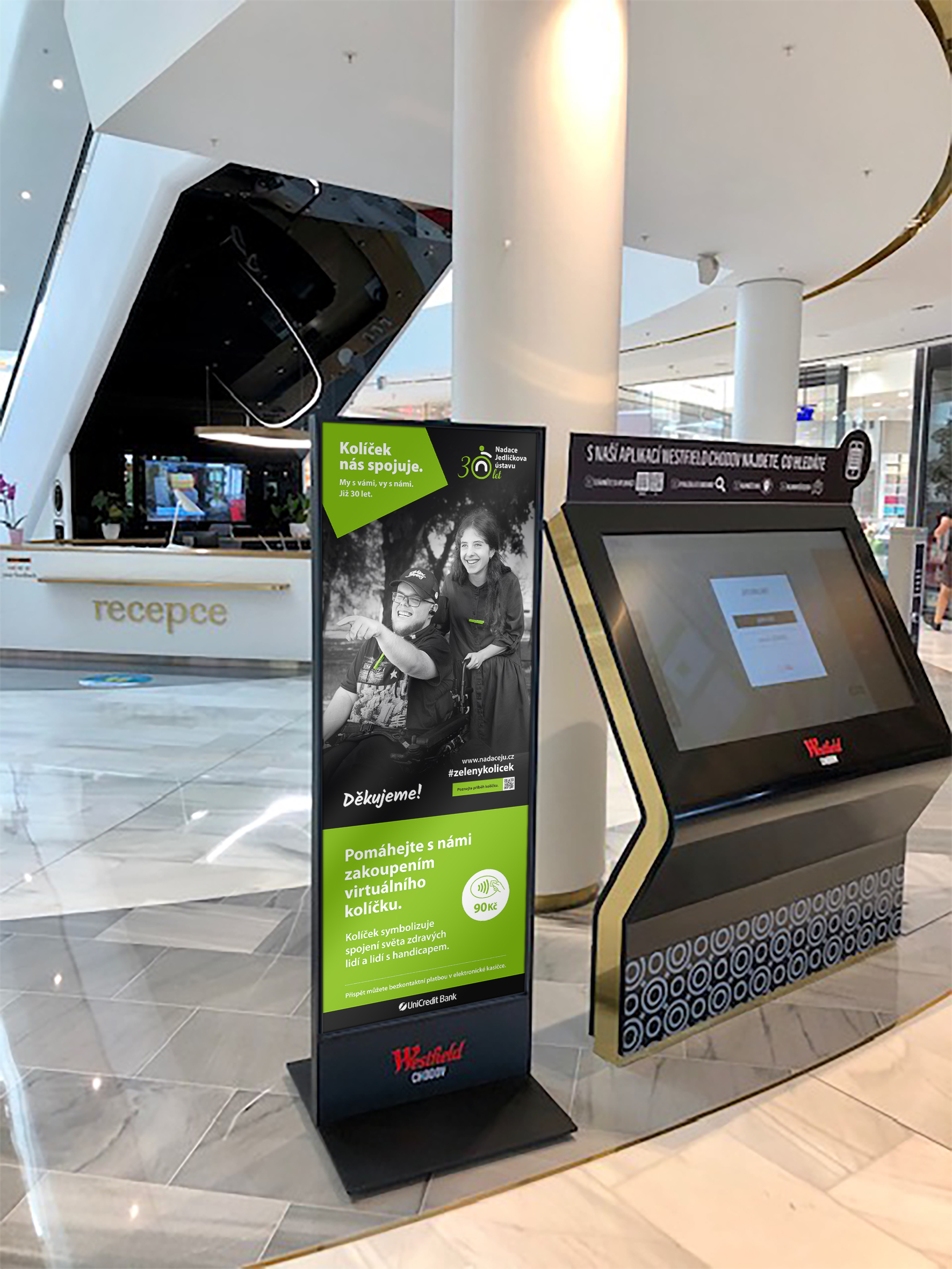
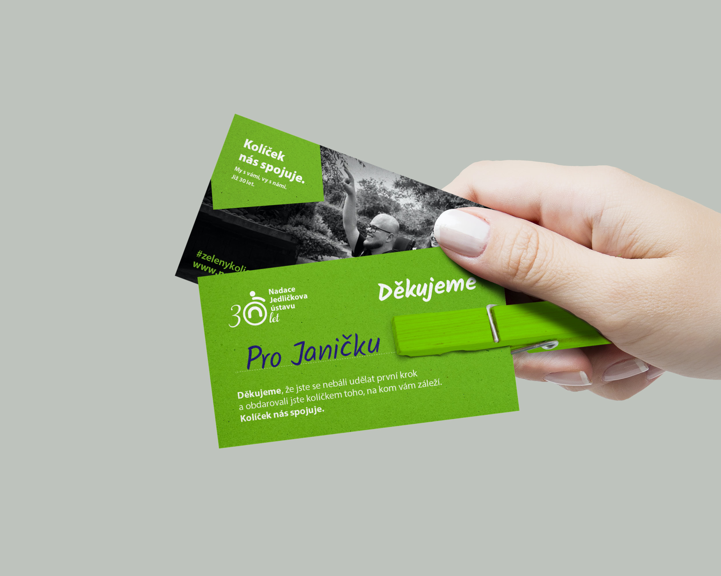
Project: Campaign & Visual Style.
Design: Jakub Dudáček & Jan Rákosník
Campaign: Týna Janoušová, Jan Rákosník & Jakub Dudáček
Client: Nadace jedličkova ústavu

